
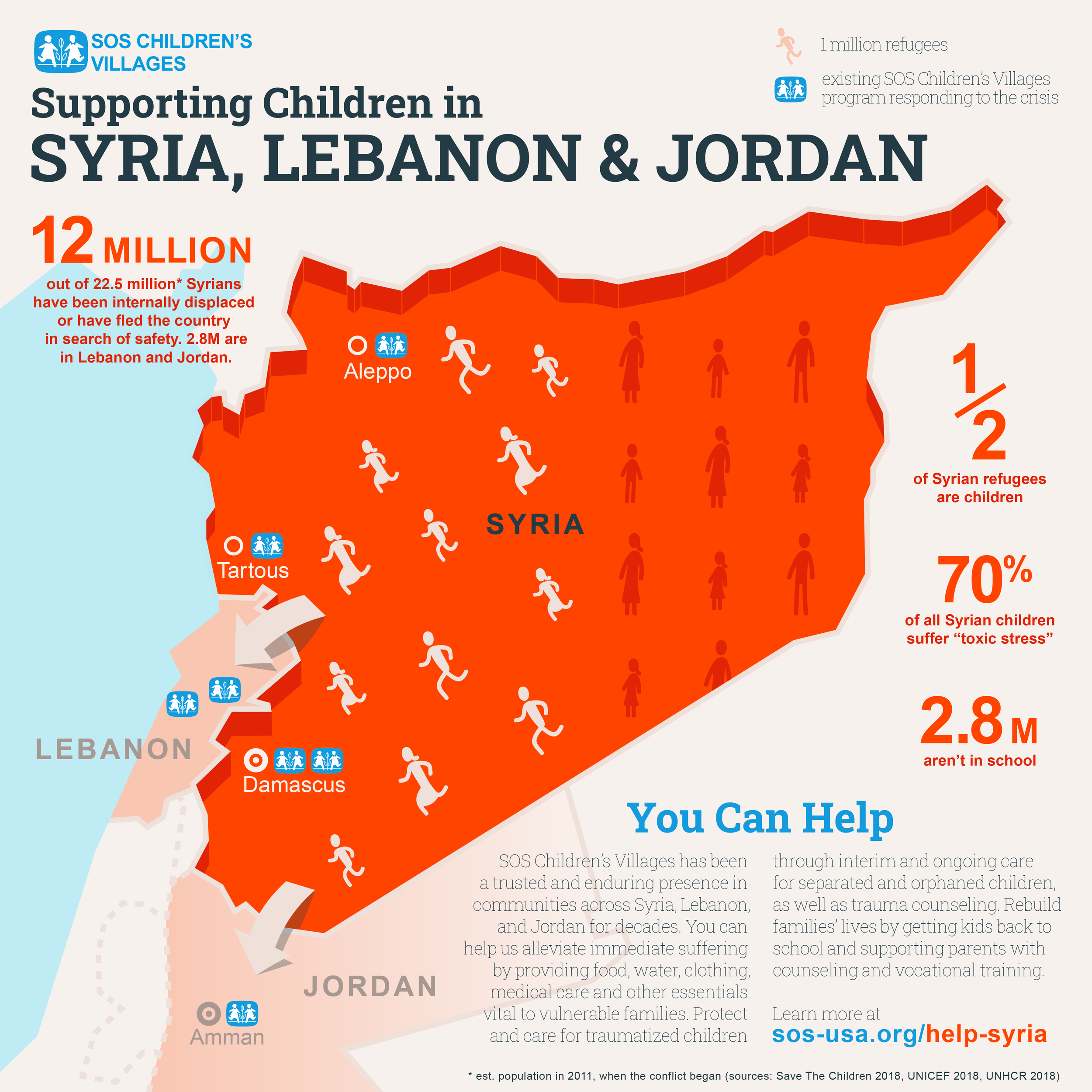
This was my spin on an ineffective infographic I received in an email. I took it upon myself to clarify several key bits of info and remove a healthy amount of clutter. The original can be seen by request : ]
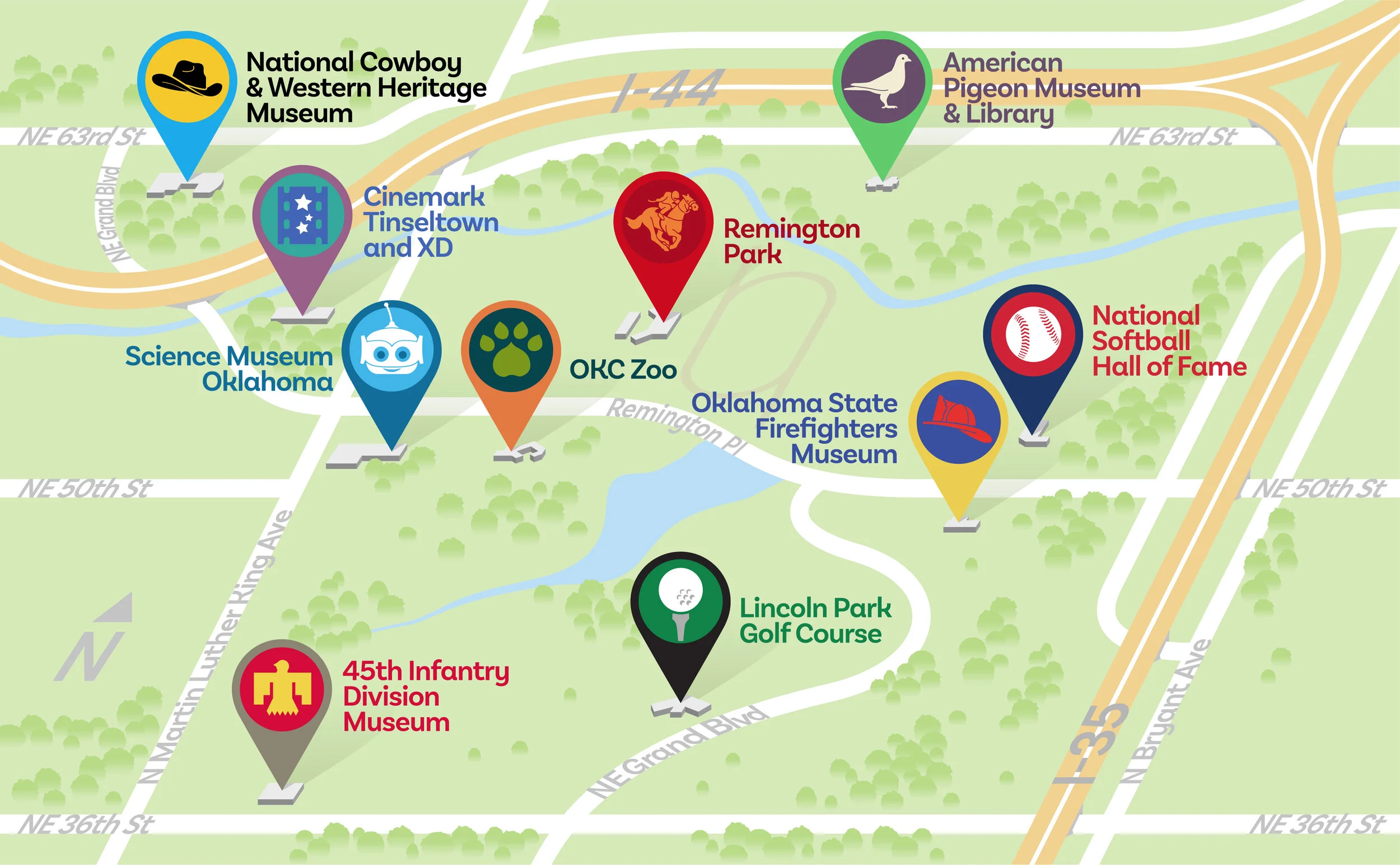
This map features a series of museums and other tourist attractions within the same square mile in Oklahoma City. The icons I created for the map correlated with descriptions on the facing page of the full informational pamphlet, which I did NOT design.
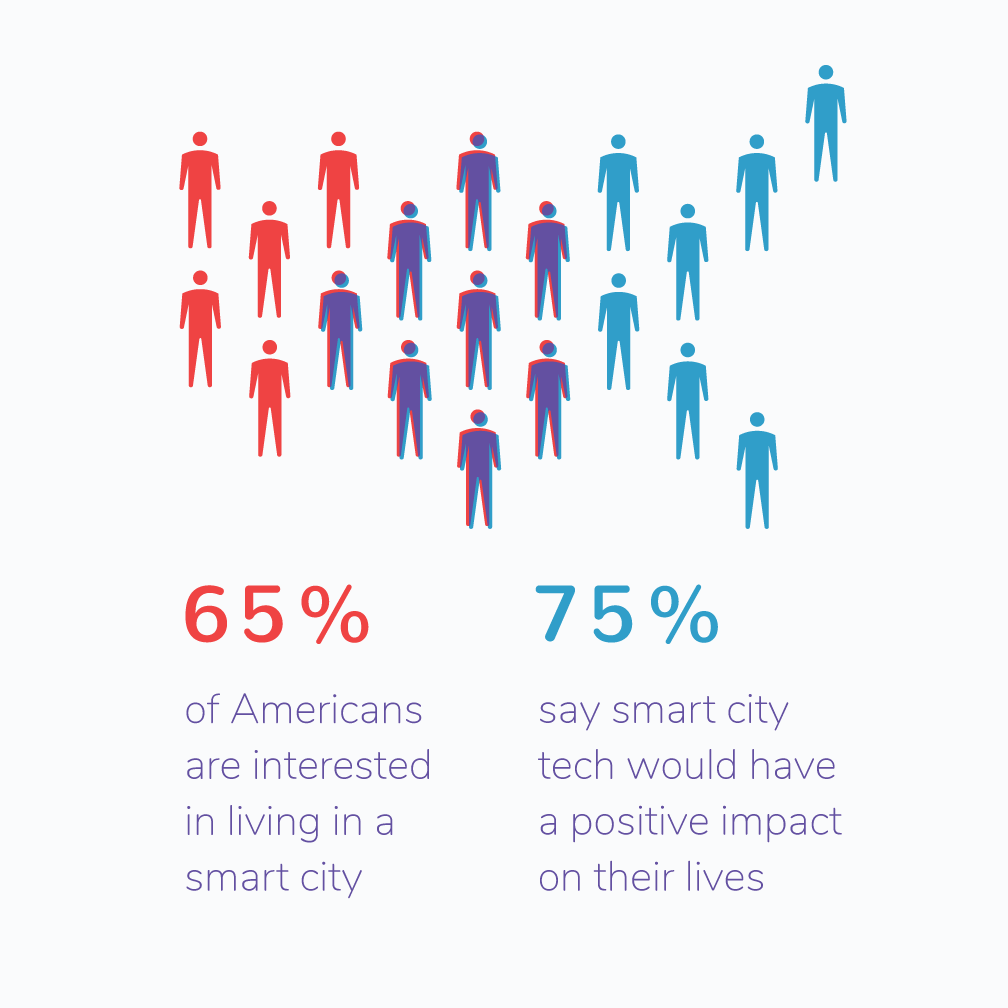
The whole truth sometimes takes a back seat to the pertinent truth. This graphic displays only those “Americans” who fell under one or both “smart tech” categories in a poll. Obviously SOME Americans must have fallen under neither, but since they’re not part of this story, I opted to omit them from the imagery. It feels a little like lying, but it’s not. Promise.
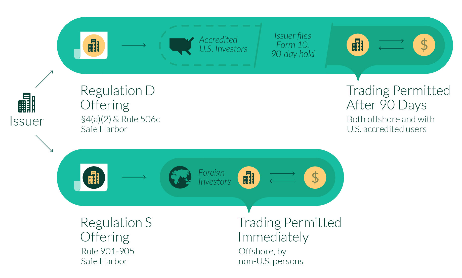
This image compares two alternate paths to offering digitized assets for trading. The primary goal was to illustrate how one path is faster, but for the discerning investor, it needed the “why”.
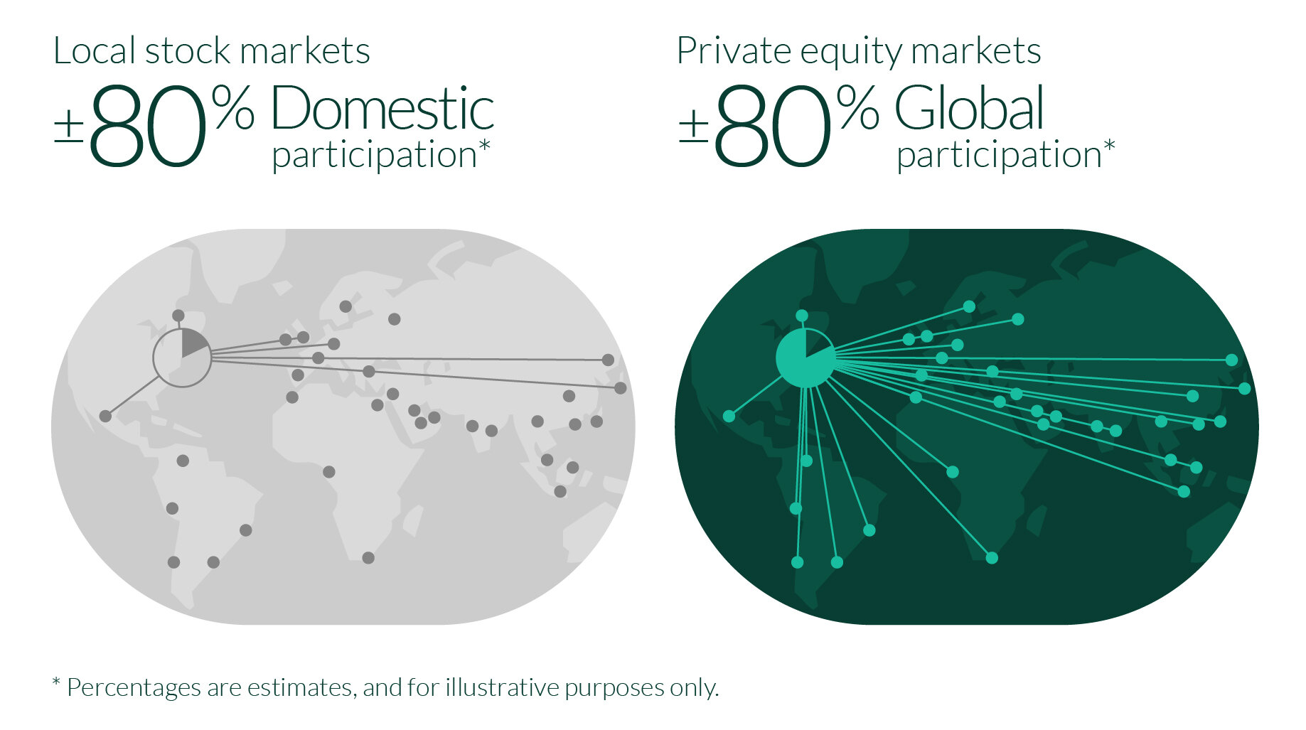
The %s for this graphic needed to be estimates, so rather than attempt to quantify fake numbers, this image emphasizes the relative benefit of trading in private equity markets.
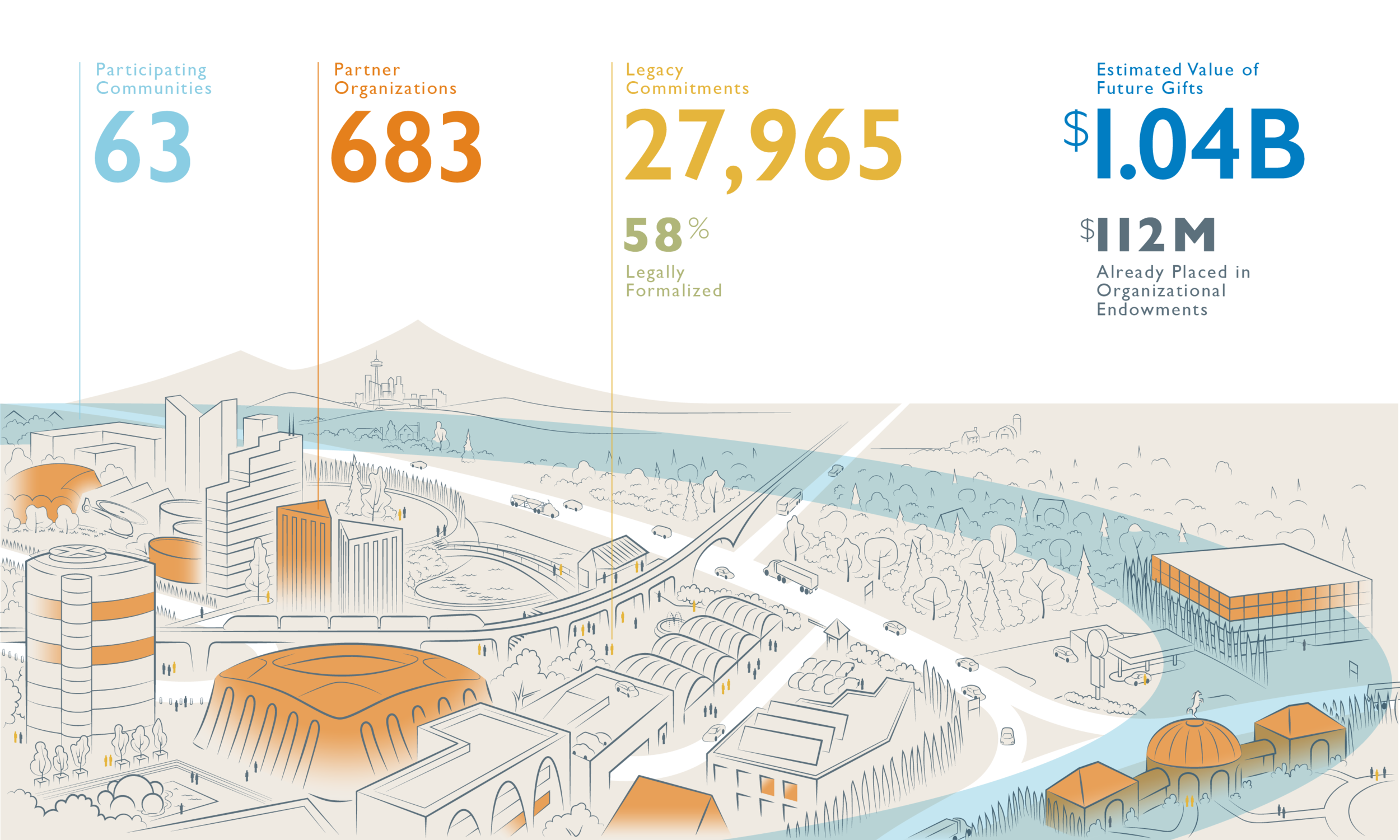
Sometimes an infographic is just an excuse to add texture and imagery to otherwise seemingly boring numbers. But if you want a viewer to spend a few extra seconds with those numbers—let ‘em soak in—might as well connect them to imagery that enhances understanding.
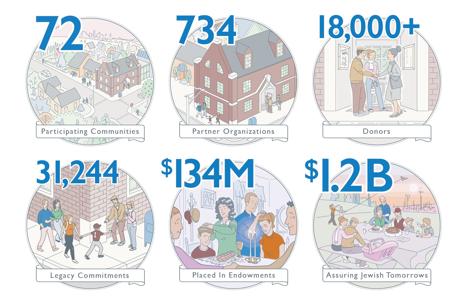
When an infographic only “needs” to communicate a few numbers, that doesn’t mean its purpose stops there. Communication of the meaning of the numbers is an entirely different tier of information to be explored. For this project, connecting the numbers to a central character and his family added depth to the whole piece by illustrating the value of those numbers to just one donor (the target audience).