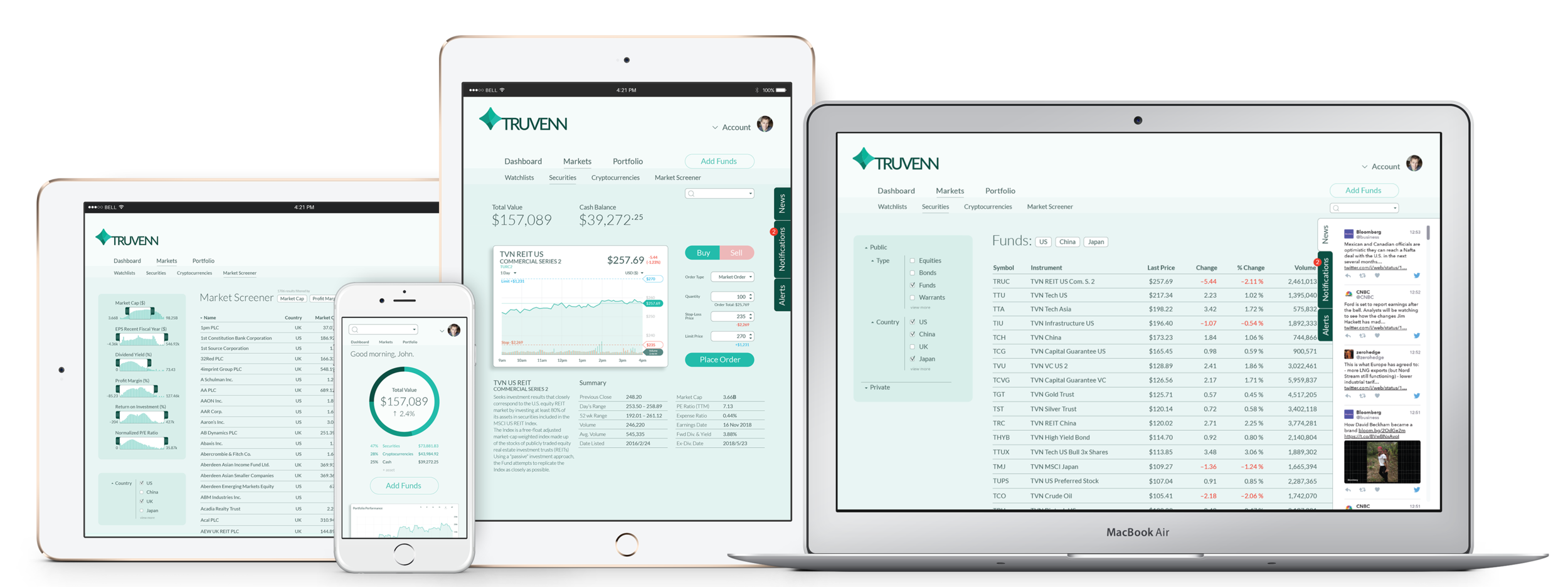
Fintech startup identity
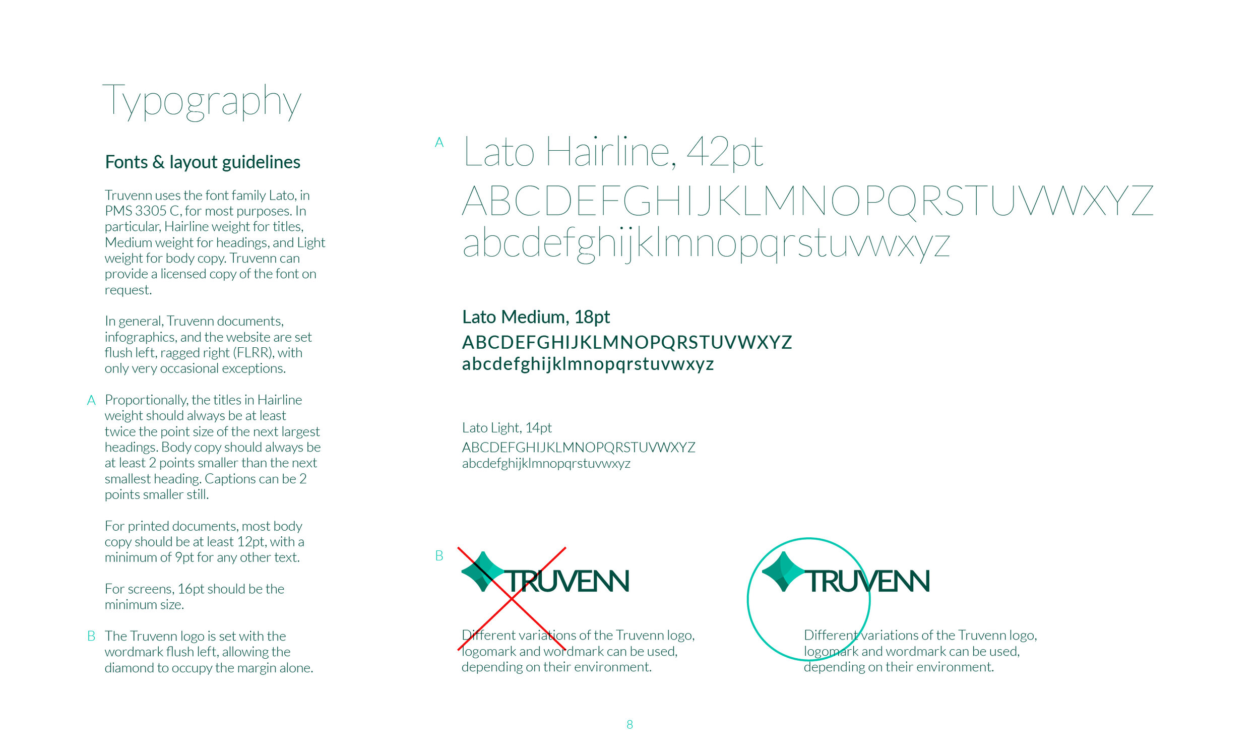
Like many branding projects, this one started with a logo design; unlike many, it ended with me as a full-time Creative Director. A title that—thanks to the nature of startups—I would not get the chance to grow into, but. Them’s the apples.
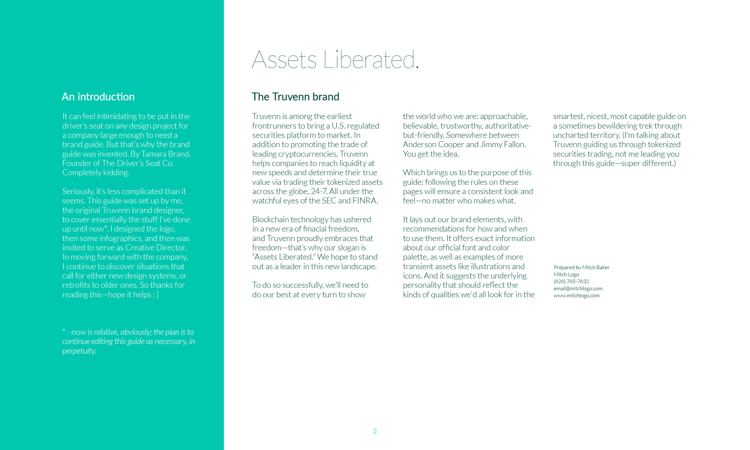
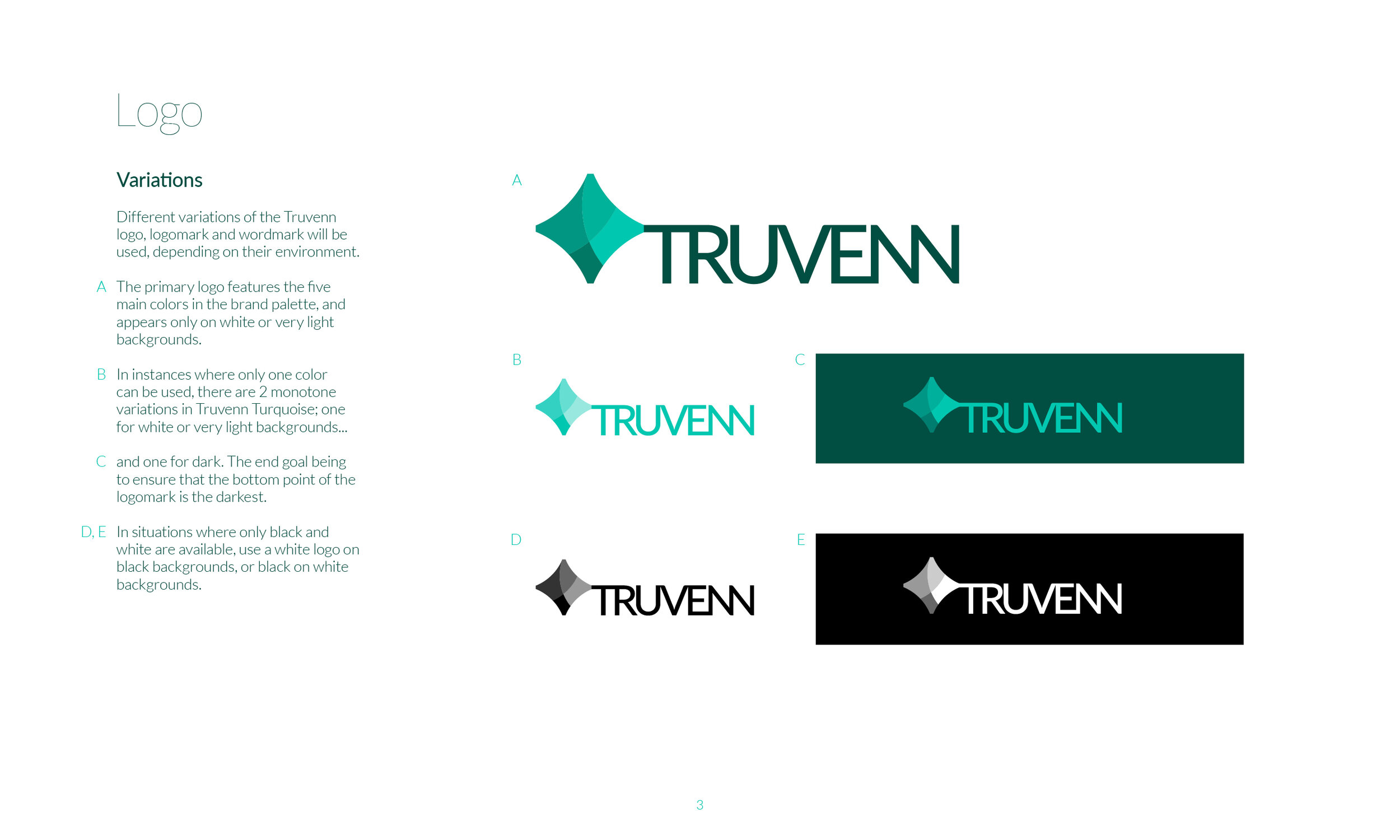
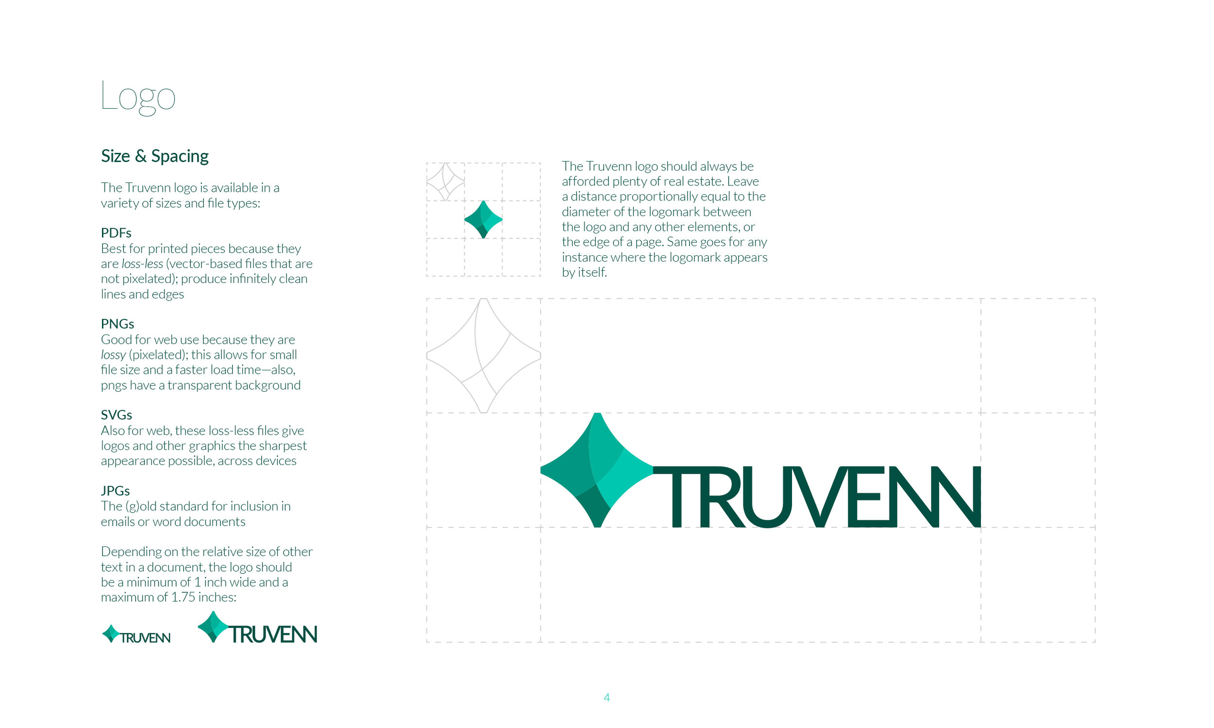
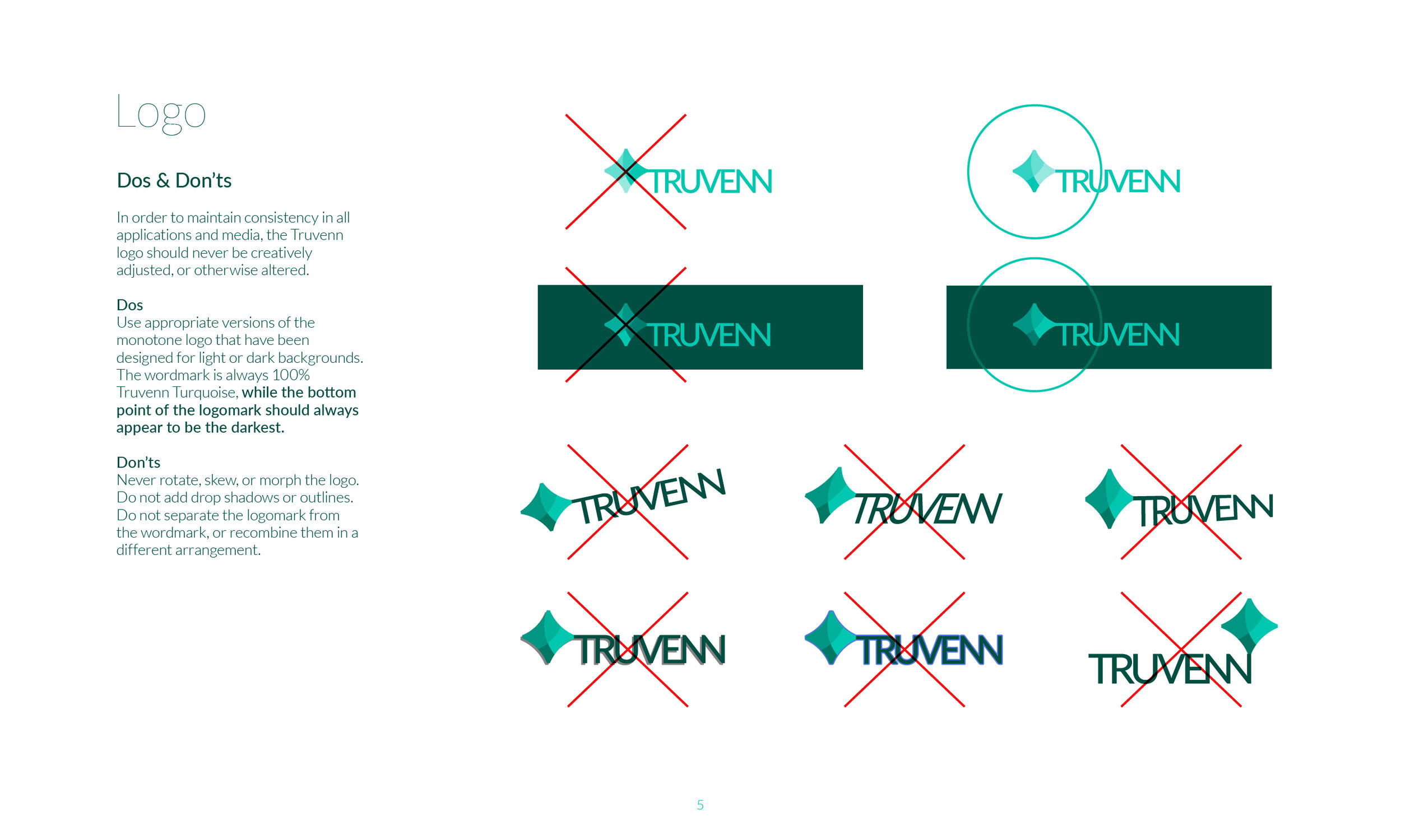
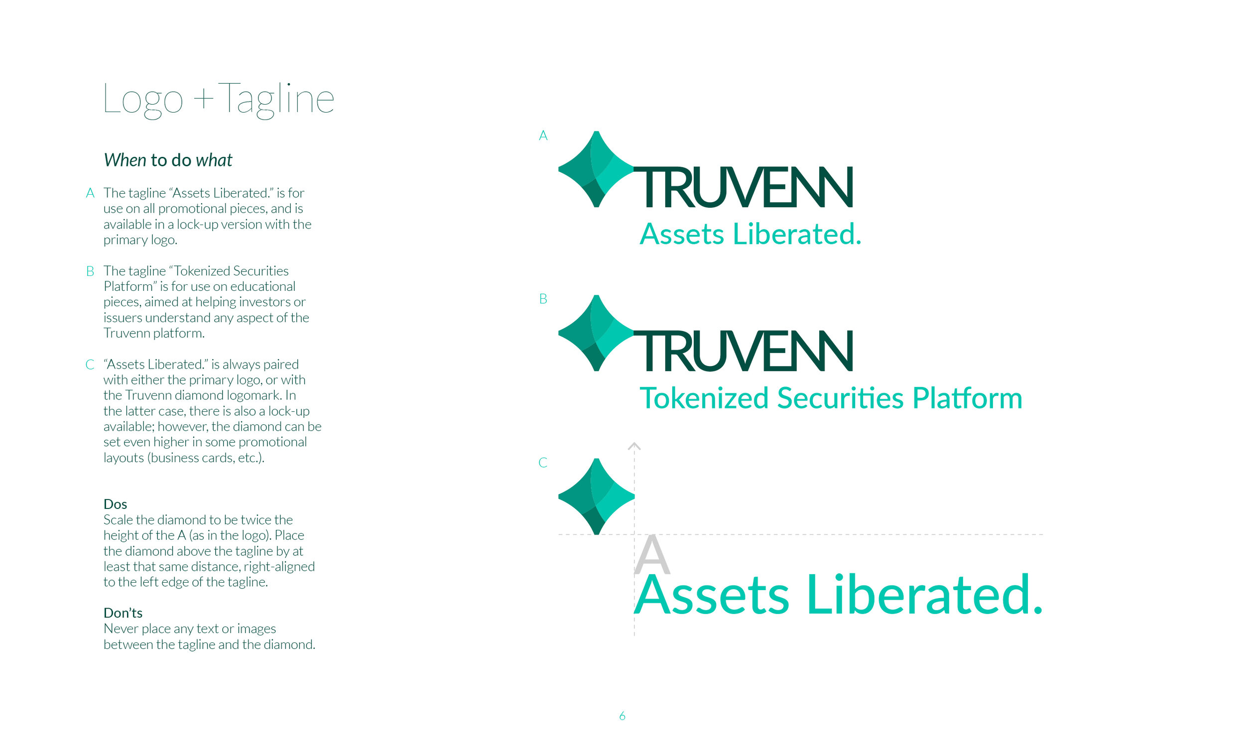
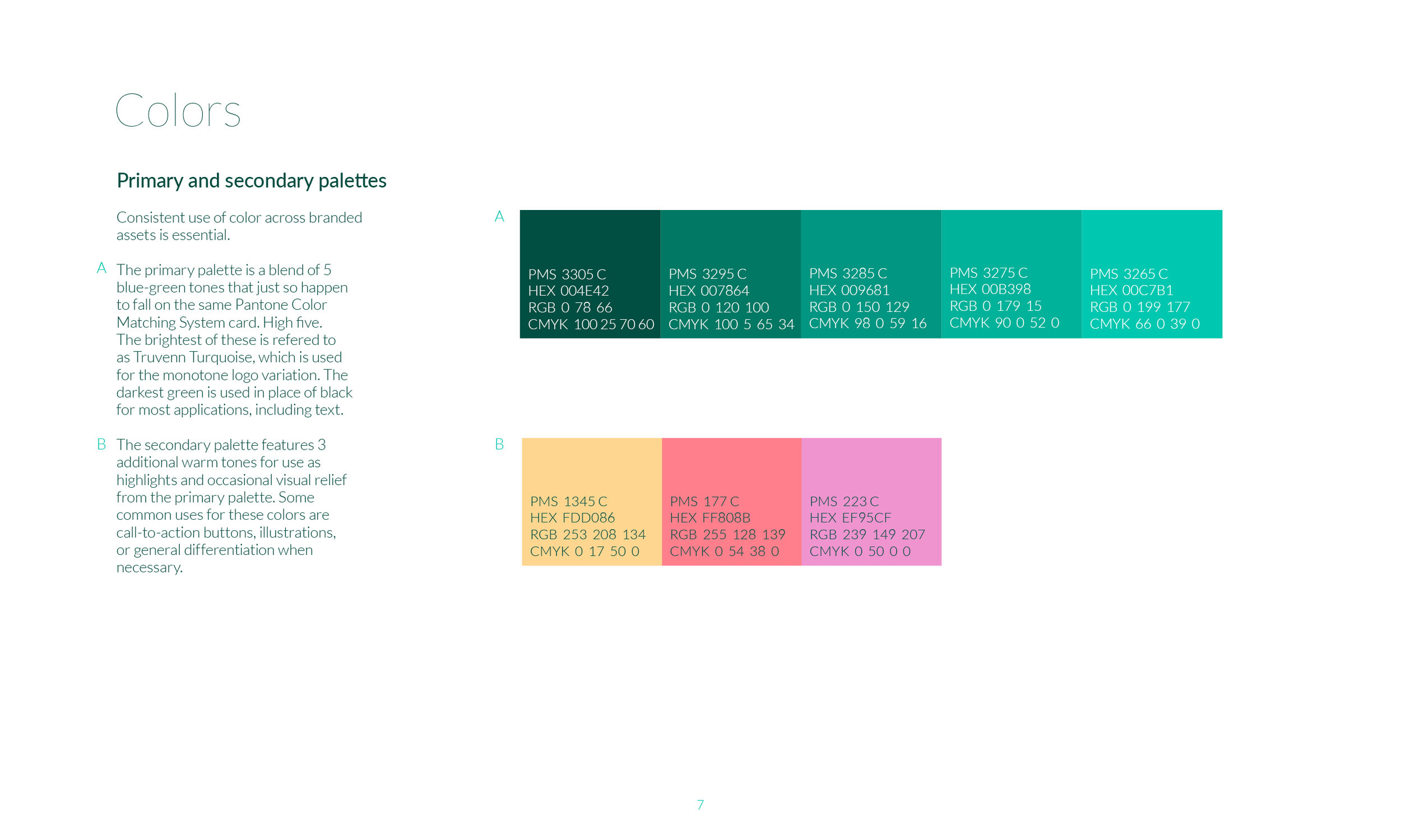
Logo & brand style guide
Collateral
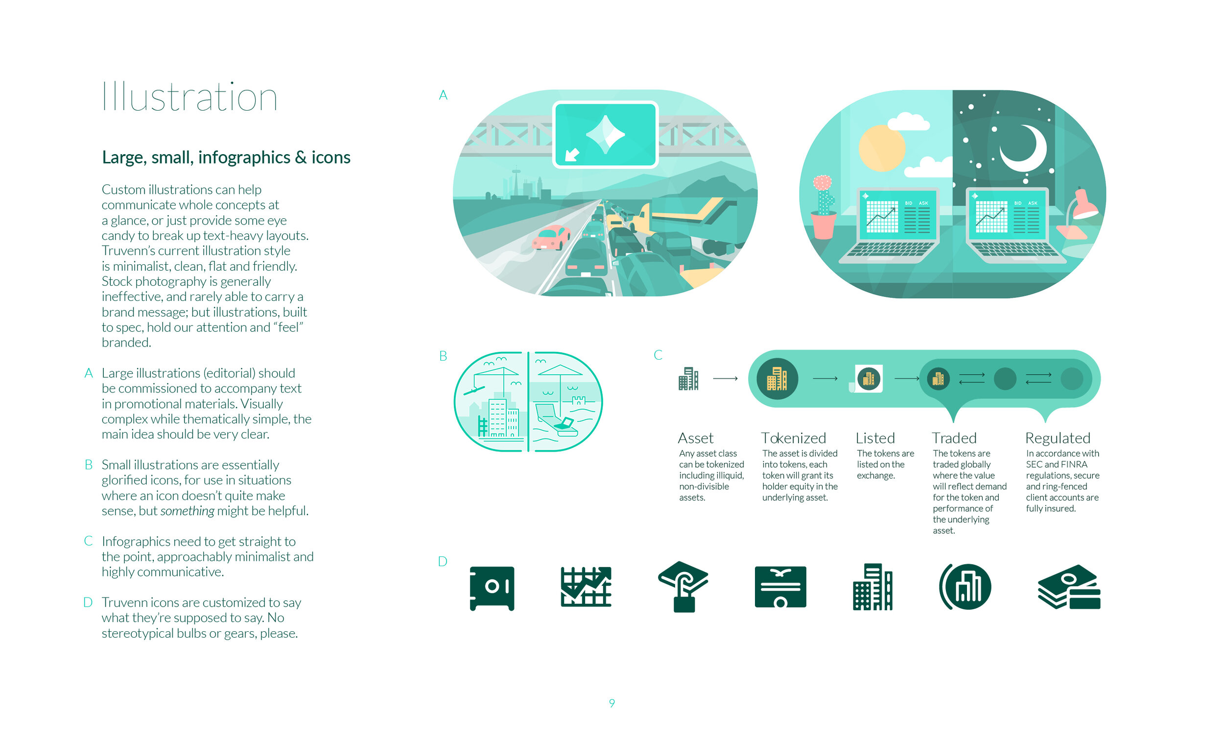
Infographics & iconography
Trading platform UI concept
Explainer video
By the time the company had to close its doors, I’d designed hundreds of branded pieces. The most involved was probably this animated explainer video I produced from start to finish in just two weeks. I co-wrote, directed, illustrated, and voiced it, collaborating with long-time friend & associate Derek Doublin at Motion Factory for the animation, and saving the company thousands of dollars in outsourcing fees.
MedTech startup rebrand + identity
Z5 Inventory works with hospital systems to streamline inventory counting, tracking, and reallocation, so that millions of dollars’ worth of medical supplies don’t end up in land fills. I was hired in 2021 to be their brand and marketing designer, and I proposed reworking the logo the week I came on board. The original had served them for nearly 6 years, and had plenty of equity within their niche, but it just needed some love.
Logo evolution
The overhauled version of the “chiclet” mark now functions as the app icon for the primary digital product—something it couldn’t do before. I set “Inventory” much smaller, matching the stroke width of the Z and 5 line work, and trading the turquoise for off-black. This allows the icon to shine—since customers will most often see the icon alone on their home screens, the word Inventory doesn’t need to play as large a role. Rebuilding the Z and 5 letterforms from scratch on a grid brought a crispness and much needed unity. It also freed the mark from any potential font licensing issues. Corners and intersections, as well as stroke width (1px at 32x32), were reimagined for visual consistency across scale.
Mascot design & “chiclet” textural elements
Z5 is recognized in its industry as “the company that gives out piggy banks” at live events. Clever swag to remind hospital CFOs and the like that using Z5 Inventory saves money. I created a mascot version of the banks to use in our collateral, which translated the brand’s playfulness and mildly irreverent tone to print and screen. I applied the cartoon illustration style throughout the collateral—it’s even led to a four-panel Z5 cartoon strip series to run in the buttoned-down trade mags.
In looking for ways to breathe more life into our updated collateral while avoiding distracting decoration, I found that screened-back chiclets are able to play a variety of functional roles, from directing visual flow to highlighting important content.
Collateral
Because Z5 is essentially all about keeping order in an historically chaotic corner of healthcare, white space plays a crucial role in this brand, as does alignment. The only elements that break the rule are the chiclets and the pigs, which add some fun to the otherwise traditionally stiff collateral pieces in this industry.
Livery of piggy banks
The mascot appears throughout the digital and print collateral, seldom more than once per page. I kept these very simple, so it’s easy to whip up a new iteration on a moment’s notice.
Informative iconography for website
Functional iconography for Z5 app
Blog banner image frames
I made a series of PSD frames available to our marketing director so he can generate a unique-ish banner each week featuring the blog image of choice (ranging from custom photos he’s taken to my drawings or mockups). Photos are used sparingly, and the hope is to eventually phase them out—they’re too expensive to produce in-house, and stock images just don’t fit the brand.
Print ads
Those buttoned-down trade mags I mentioned are also a great canvas for Z5’s colorfully illustrated print ads. The piggy bank’s style shifts occasionally, but never abandons its most basic structure and color palette. Being the only piggy bank mascot in town also allows for some wiggle room, in case different illustrators are enlisted in the future.
CBD industry
I contracted with a CBD white label manufacturer for 18 months, as well as several trusted independent brands, to develop shelf-worthy logos and labels. I also provided digital/printed price sheets, catalogs, and product mockups.
Mead microbrewery
Logo & label design
The logo came first, inspiring an illustrative label design. One of the primary goals we set for this introductory “experimental series” label was to incorporate some element that would allow for more varietals down the road. The shadow cast by the Middle Child logo encircles the bottle almost entirely, and further colors, patterns, or specialty printing effects could represent their future flavors.
Commercial real estate
Price Family Properties operates a handful of protected, historical Art Deco buildings in downtown Tulsa, Oklahoma. Their marketing firm, Resolute PR, hired me for a rebrand in 2017.
Logo
As a rule, I never use a company’s initials as the foundation of a logo design unless A) the company goes by their initials, or B) the initials aren’t immediately apparent but can serve as some sort of structure. While trying to develop a unique Art Deco pattern, I discovered several historic ones that relied on split circles and chevrons. A hint of “PFP” can be seen in this mark, which also features darker bronze detailing that can be omitted when the logo appears at small scales.


